WSJ app: live updates, AI Read to Me, identity merge, Media tab
One of four PMs on the WSJ app: live updates for fast-moving news, AI Read to Me, the login and identity merge across Dow Jones brands, and a video-first Media tab.
- Company
- Dow Jones
- Role
- One of four PMs on the WSJ app
- Timeline
- 2021 – 2023
- Platforms
- Mobile
- Type
- Feature
TL;DR
- Problem
- The Wall Street Journal app is part of Dow Jones's consumer subscription products, which reach 10M+ monthly users. Four product managers shared it.
- What I did
- As one of the four, my work covered real-time news, the 'AI Read to Me' audio feature, the login and identity merge across Dow Jones brands, and a video-first Media tab.
- Result
- Live updates, the format we started for the war in Ukraine, increased readership, reach and ad revenue, and the format was then used for other events. Read to Me shipped in my time.
Context & problem
The Wall Street Journal app is where a subscriber reads the Journal on a phone. It is part of Dow Jones’s consumer subscription products, which reach more than 10 million monthly users, and at Dow Jones I was one of four product managers on it.
My work covered four parts of the app: real-time news, the “AI Read to Me” audio feature, the login and identity merge, and a video-first Media tab. They look unrelated on a feature list. What ties them together is the subscriber’s time. A news subscription lives on habit, and each of the four removes a reason to put the app down: news that moves faster than an article, a moment when the reader can’t look at a screen, a sign-in that doesn’t carry across brands, a story that is better watched than read.
The Barron’s app, where I was the sole PM, has its own case, and so does the ML personalization of the feeds, where my part was the success metrics and the A/B testing.
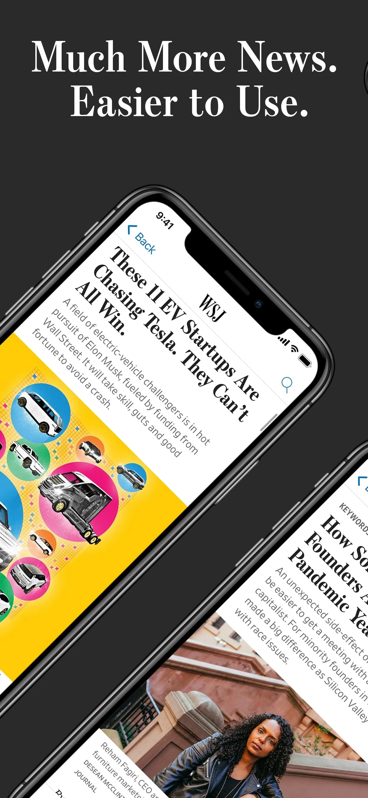
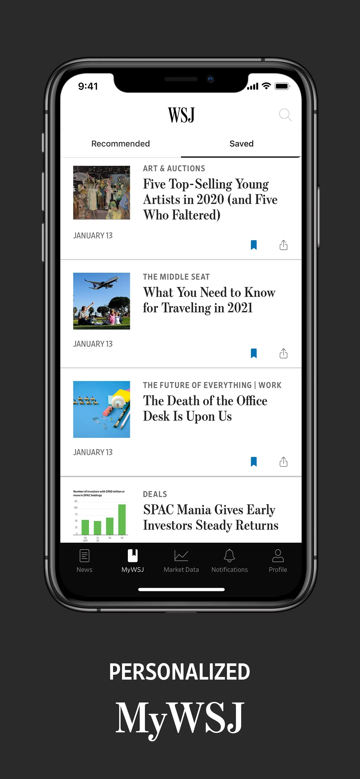
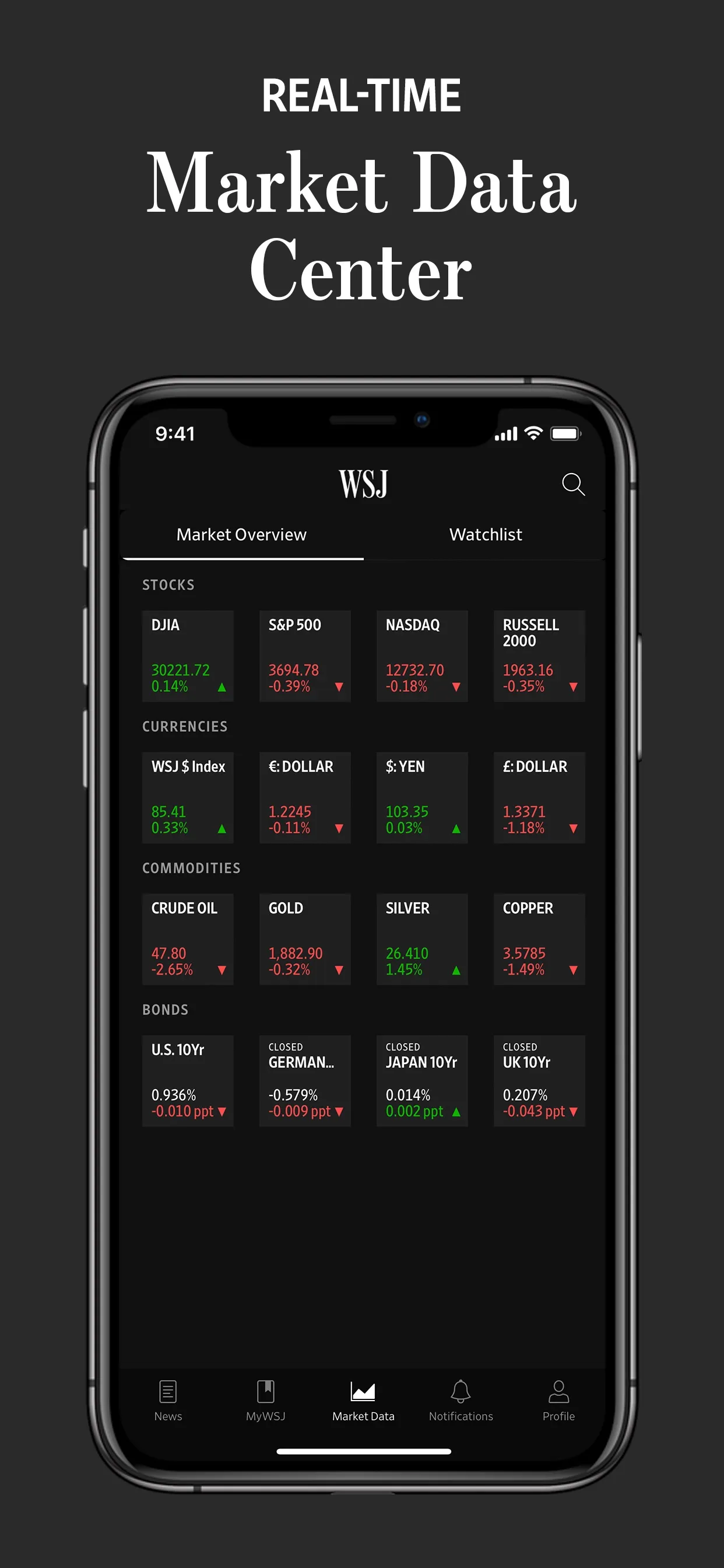
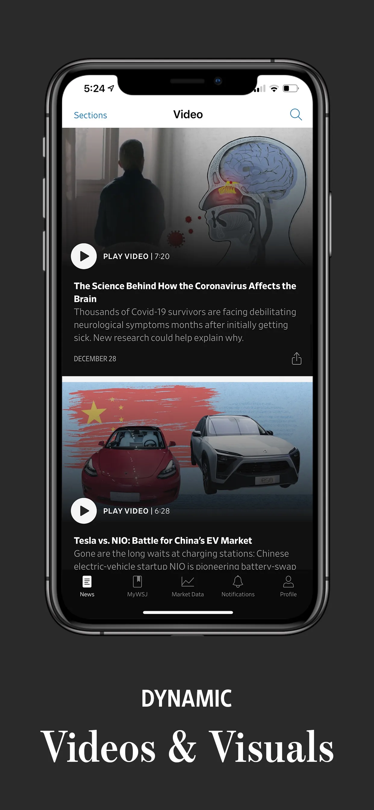
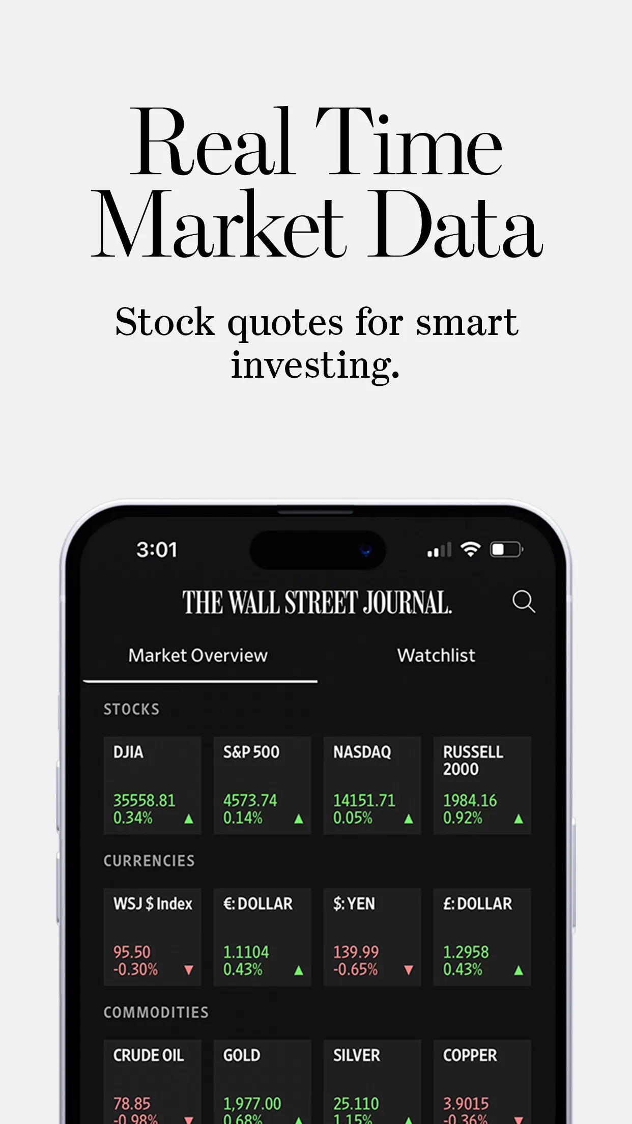
The store listing from mid-2021, shortly before I joined, shows the app this work started from: a news feed, a personalized MyWSJ, a real-time Market Data Center and a Video section, with a bottom bar of News, MyWSJ, Market Data, Notifications and Profile.
Discovery & insight
The clearest insight in this work came from the newsroom. When the war in Ukraine started, the story was changing constantly and reporters were filing updates faster than a traditional article could carry them. For an ongoing major event, the article stopped making sense as a format. Journalists needed a way to publish facts as soon as they had them, and readers needed one place to follow them.
HypothesisBy changing a fully formatted article for each development to one live-updates page of short, titled entries that journalists publish as the facts come in for readers following an ongoing major event, we expect readership and reach to move, because reporters were filing updates faster than an article could carry them, and the newsroom wanted to inform readers as soon as possible.
The same question runs through the other three: where does the current format make the subscriber work harder than they should, and can we change the format rather than ask more of the content?
Strategy & bets
Live updates: change the container, not the reporting. The reporting was already there. The bet was that readers following a fast story want the latest fact first, on a page they can come back to, and that a single page of short, titled entries serves them better than a run of separate articles. It also lets journalists around the world publish without formatting a full piece each time.
AI Read to Me: reach the subscriber when they can’t read. Listening opens up time a reader can’t spend looking at a screen: a commute, a workout, the chores. The bet is that audio extends the subscription into those hours instead of competing with reading.
Login and identity merge: one way in. The merge brought together the accounts across Dow Jones, WSJ, Barron’s and MarketWatch among them. A reader who subscribes to more than one Dow Jones brand, or moves between them, should not have to manage a separate account for each. Identity sits underneath subscription access, so this is work where getting it wrong locks out a paying reader. What I watch for on a change like this is everyone who must still be able to sign in afterwards, more than the new flow.
Media tab: video built for watching. The app already had a Video section. The bet was a tab that puts video first, built on short-form, feed-based patterns, for the stories that are better watched than read.
On a shared app, the hard part is rarely the idea. Four PMs can pull on the same screens and the same engineering time, so each bet has to earn its place against the others, and the subscriber has to experience one app, not four projects.
Solution
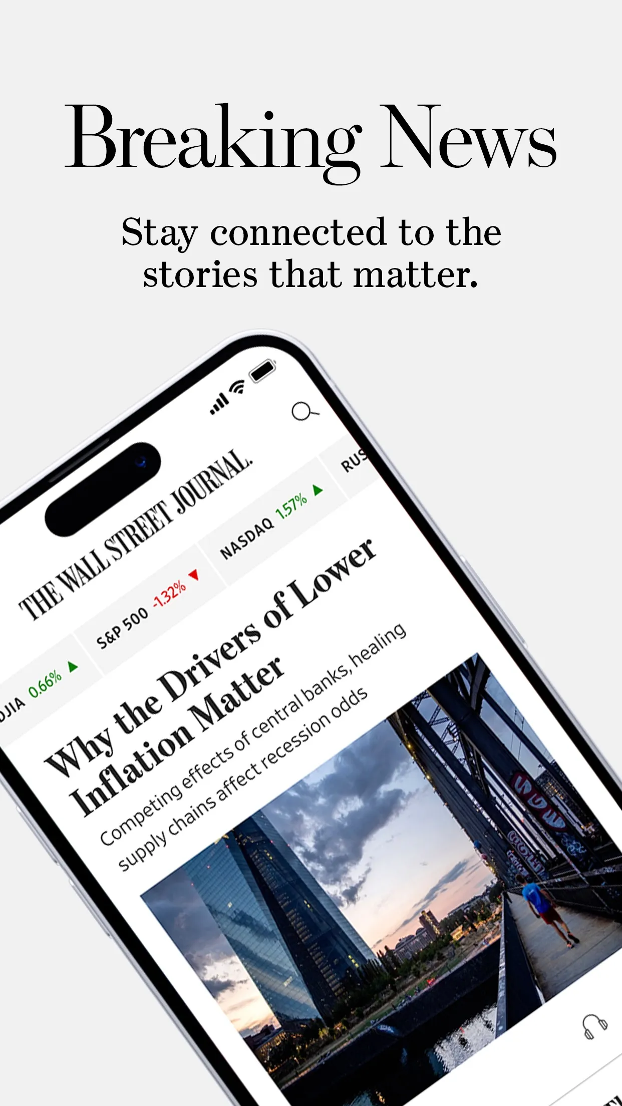
Real-time news and live updates. A live-updates page is one page per ongoing event, made of short entries with their own titles, published as reporters file them, in place of a full article for each development. The listing today, after my time, leads with breaking news.
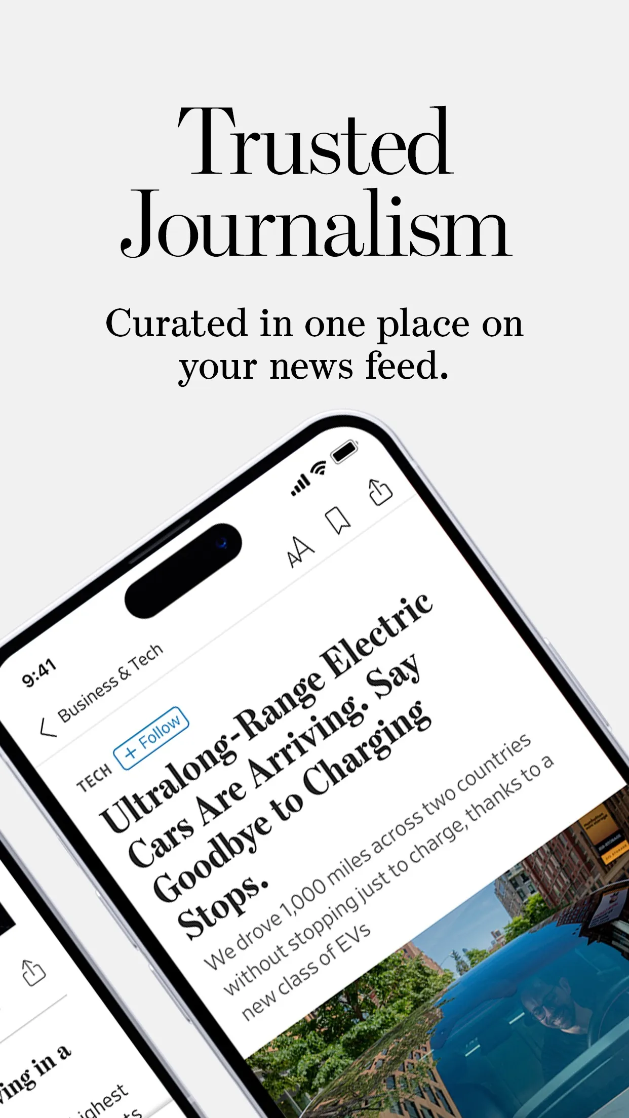
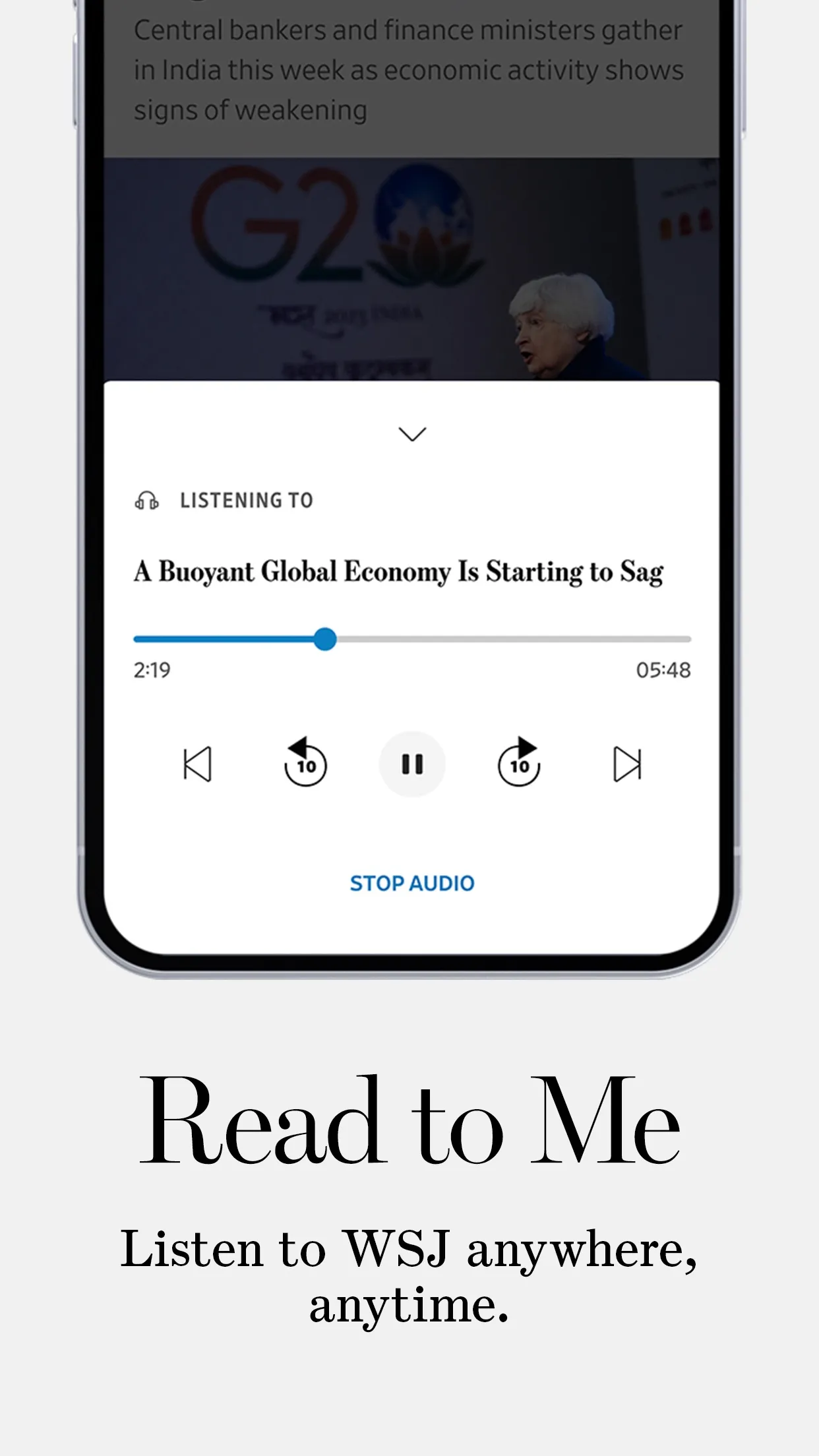
AI Read to Me. Read to Me plays an article as audio, so a subscriber can listen to the Journal while doing something else. The panel at the top of this page shows it as the store presents it now: an article playing, a progress bar, skip controls and a Stop Audio button. It shipped while I was at Dow Jones.
Login and identity merge. There is no screen to show for this one. When it works, a reader notices nothing except that one sign-in carries across the Dow Jones brands.
Video-first Media tab. Compared with the Video section in the 2021 listing, the Media tab was upgraded visually, loads faster and runs more stably, and it added subtitles and accessibility features. Subtitles let someone watch with the sound off, and accessibility features open video to more readers.
Execution
Four PMs shared the WSJ app, and the four features on this page are the ones my work covered. Across Dow Jones, the work meant resolving dependencies across content, identity and subscription systems, and the identity merge is the clearest case of that: one change touched every brand’s accounts.
On a shared app I start by agreeing the boundaries with the other PMs, so each of us knows which screens and which decisions are ours, and by keeping one picture of the subscriber that all four workstreams are judged against.
Validation & results
Live updates increased readership and reach. We saw the clicks, and a lot of users searching, drawn by the short titles; it all went to one page, and we were able to increase ad revenue dramatically. The format was then applied to other events, which matters to me more than the first lift: it outlived the story that started it.
For the other three, these are the signals that tell me whether each one is doing its job. For Read to Me, whether listening adds time with the Journal or only replaces reading. For the identity merge, sign-in success and the support contacts that follow a change to accounts. For the Media tab, load time, playback stability and whether people watch to the end. I read them per feature, because a single app-wide number would hide which of the four is pulling its weight.
Reflection
Being one of four PMs on a shared app is a different job from owning one. The work is as much about boundaries and sequencing as about features, and the subscriber should never be able to tell where one PM’s area ends and the next begins.
Live updates taught me to look for the moment when the format, not the content, is the problem. The reporting was there; it didn’t fit the container. When I see a team pushing harder on content that isn’t landing, the first thing I ask now is whether the shape of the product is in the way.